Mastering User Experience Fundamentals: Color Theory and Visual Hierarchy
360 Views
Summarize Article

Are you ready to disrupt with AI? Join our Hackathon today! Click to Register
By WebOsmotic Team | Published on February 18, 2025
Summarize Article
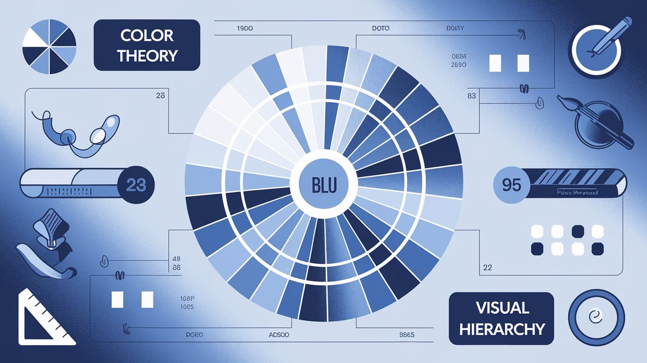
Table of Contents
ToggleMastering user experience fundamentals is the game-changer in today’s competitive digital landscape for businesses and designers alike. Whether you’re creating a website, app, or digital product, you can be sure of a seamless, intuitive experience when you understand the core principles of UX design fundamentals – color theory and visual hierarchy.
Color and hierarchy aren’t only aesthetically appealing- they significantly influence usability, brand perception, and engagement. This blog will dive into these UI/UX design fundamentals and what they entail for exceptional digital experiences.
Before delving into color theory and visual hierarchy, let’s first define what user experience is. These principles are what lead designers to create usable interfaces and incorporate elements such as usability, accessibility, consistency, and aesthetics. They help make the digital journey intuitive, efficient, and enjoyable for the user.
Main UX fundamentals:
Now, let’s see how color theory and visual hierarchy apply to these principles.
Color theory studies color interactions, their psychological impact, and how they affect human perception. In UX design, color is not merely decorative—it significantly impacts user navigation, interaction, and engagement. Proper use of color enhances the user experience, making interactions intuitive and visually appealing.
Primary Colors: Red, blue, and yellow
Secondary Colors: Green, orange, and purple (created by mixing primary colors)
Tertiary Colors: A mix of primary and secondary colors
Color Harmonies: Combinations that create balance, such as complementary (opposite colors) and analogous (adjacent colors)
Color Psychology: The impact colors have on emotions and behavior
Different colors evoke different feelings. Here’s a breakdown:
| Color | Meaning & Usage |
|---|---|
| Red | Energy, urgency, passion (e.g., sales banners) |
| Blue | Trust, calmness, professionalism (e.g., corporate websites) |
| Green | Growth, nature, health (e.g., eco-friendly brands) |
| Yellow | Happiness, attention, warning (e.g., call-to-action buttons) |
| Black | Elegance, power, luxury (e.g., fashion brands) |
| White | Simplicity, cleanliness, minimalism (e.g., medical websites) |
| Principle | Explanation |
|---|---|
| Contrast | Ensures readability by making text stand out against its background. |
| Complementary Colors | Opposites on the color wheel create a visually appealing effect. |
| Analogous Colors | Colors next to each other on the wheel create a harmonious look. |
| Accent Colors | Draw attention to key elements like call-to-action buttons. |
Uses a black background and green action buttons.
High contrast improves readability and navigation.
Users can interact with the platform effortlessly.
Visual hierarchy arranges elements to guide a user’s focus, ensuring they quickly spot the most critical information on a page. A well-structured visual hierarchy directs users’ eyes efficiently, helping them comprehend and engage better.
Size & Scale – Larger elements attract attention first.
Contrast & Color – Bright and bold colors stand out.
Alignment & Spacing – Proper arrangement makes content easier to read.
Typography – Font size, weight, and style help differentiate headings and text.
Proximity & Grouping – Related elements should be placed close together.
| Element Type | Example | Importance Level |
|---|---|---|
| Headline | “Best Deals of the Year!” (Large, Bold) | High |
| Subheading | “Limited Time Offer” (Smaller, Medium Weight) | Medium |
| Body Text | “Shop now to save 50% on select items.” (Regular, Normal) | Low |
| Call-to-Action | “Buy Now” Button (Bright Color) | Very High |
Uses bold typography for headlines.
Larger images highlight featured destinations.
Contrasting colors emphasize important call-to-actio
Combining color and hierarchy makes UX design more effective. Here’s how:
Highlighting Important Information – Use bold colors for CTAs and headings.
Creating Focus Points – Guide users’ eyes using contrast and size.
Improving Readability – Dark text on a light background ensures clarity.
Building Brand Identity – Consistent color schemes strengthen recognition.
Enhancing Navigation – Clear sections and color coding improve user flow.
Avoid the following mistakes when dealing with UI/UX design basics:
Mastering the basics of user experience – such as color theory and visual hierarchy – is an essential step to making intuitive designs. These rules are not only beneficial for the usability of designs but also increase brand identity and boost user satisfaction. By applying UX design fundamentals, you can craft interfaces that are not only functional but also visually stunning. Remember, successful design is about understanding your users and putting their needs first.


