How AI is Transforming Web Design Workflows in 2025
268 Views
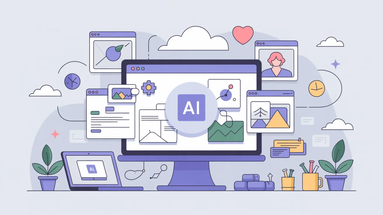
Summarize Article

AI takes on the busy work in design and build, suggests smart options based on real usage, and surfaces risks early, while humans set goals, taste, and guardrails. The result is a calmer web design workflow where teams ship faster without losing quality.
You may be curious: does this replace designers? It does not. Tools draft and check. People decide, shape their voice, and carry the final call.
Models got better at understanding layout intent, tone in microcopy, and patterns inside analytics. They now generate variants that respect your grid and tokens, write starter content in your brand voice, and link design choices to numbers like tap accuracy or time on task. The big shift is speed in small steps, not one-click page builders. Also, you can read about the latest UI/UX design trends.
Developers using AI pair-programming completed coding tasks 56% faster in controlled trials, per this McKinsey analysis. Upload call notes, chat logs, and quick survey results. The assistant clusters themes, pulls exact quotes, and highlights recurring pain points. You still review sources and mark weak clusters, yet the first pass lands in minutes instead of days. Add a short sanity check, then turn those themes into two clear jobs to be done.
AI proposes menu groups and page hierarchies based on common user paths and search terms. You keep control by locking key sections and asking for only two alternatives. Then run a five-minute card sort with three users, compare notes, and pick the simpler map.
Provide a short voice guide and two live examples. The tool drafts headlines, helper text, and empty states that match that tone, plus alt text that explains purpose. You edit for clarity and accuracy, and keep a human check on sensitive screens like payments and consent.
Feed in current tokens for color, type, spacing, and motion. The assistant suggests smaller palettes, fixes contrast gaps, and flags components that drift away from tokens. One token tweak updates many places, which keeps screens in sync without a file hunt.
Give the tool a goal, a grid, and a content list. It returns two or three layouts that respect the grid and show hierarchy clearly. You pick one, refine spacing, and place actions where thumbs reach easily. The key win is more time to judge, less time nudging boxes.
Click a button and get a working path with real text and basic motion. The assistant inserts states like loading and error, plus a skeleton screen for slow-loading data. You still tune timing and interaction, yet the gaps shrink a lot.
Components export with specs, tokens, and state notes in one bundle. The assistant writes starter tests and maps props, which cuts back-and-forth. Engineers still shape the codebase, yet fewer details slip through.
Automated checks scan contrast, focus order, and target size. For accessibility with AI, see how AI enhances inclusive web design. Another pass measures LCP, INP, and CLS, then suggests small fixes like font loading or image sizes. You decide what to ship now and what to schedule.
It can if teams ship the first draft untouched. Use the tool to explore options, then apply brand rules, layout rhythm, and tone. Lock signature choices as tokens so components inherit them, avoiding ad hoc tweaks and drift across screens.
Treat drafts as a quick start, not the final truth. Keep a short style guide, add legal guardrails, and review sensitive screens like pricing or consent. Aim for faster iterations with edits so voice stays on-brand and risky claims stay out.
Only as well as the input you provide. Feed real examples, recent analytics, and clear segment labels so guidance matches actual users. Poor inputs create bland output, so curate sources, note recency, and keep a review loop to catch misses.
It should help, not slow them down. Handoff bundles specs, tokens, states, and example props in one place, so engineers spend less time tracking down details. Clear packages reduce rework, speed code reviews, and give QA a contract for tests and edge cases.
In enterprise pilots, 90% of developers felt more fulfilled and 95% enjoyed coding more when using Copilot, according to this GitHub–Accenture study.
Week 1: pick one high-traffic flow, define two success metrics, and gather input assets like voice samples and analytics. Turn on automated checks for contrast and target size.
Week 2: generate two layout variants that respect your grid, then pick one and tune hierarchy. Draft microcopy that matches brand voice. Run a quick test with three users and capture the two biggest fixes.
Week 3: export components with tokens and states, ship a small slice, and measure LCP, INP, and task time. Fix one performance issue and one access issue.
Week 4: set a weekly insights digest that turns analytics into three bullets and one proposed change. Close the loop by shipping one tweak based on that note.
AI does not replace designers. It removes busy work, offers useful options, and keeps an eye on quality, while humans carry intent, voice, and ethics. Start with one flow, one metric, and one tool per bucket. Keep rules simple, keep evidence close to the build, and run quick tests with real users.
With that posture, your web design workflow becomes faster, steadier, and kinder to the team, and the product feels clearer for everyone who uses it. Want help wiring tokens, checks, and handoffs into your workflow? Explore our UI/UX design services.


