How to Create a Custom Cursor Website That Stands Out
217 Views
Summarize Article

A custom cursor website isn’t a trick to impress visitors. It’s a small detail that, when done right, makes your website feel thoughtful and interactive. It guides the eye, signals actions, and adds personality without slowing the page or confusing users. However, speed also matters. According to the Nielsen Norman Group, even a 0.1-second delay in interaction feedback (including cursor responsiveness) can affect user confidence and task flow.
Therefore, creating a custom cursor website from expert development services is the best option if you’re not yet skilled enough. This guide shows you how to design a responsive cursor that works for people, not just screens.
Start with a purpose, not a trend. Pick one job the cursor will do well. It can signal “you can click here” or it can show “you can drag this area.” If you cannot name the job in one line, skip the effect or keep it for a single page like a portfolio or a product story.
Use a custom cursor on website pages that need clear affordance, like galleries or drag areas. If you’re framing this as part of broader product discovery, align the cursor’s job with a user goal first.
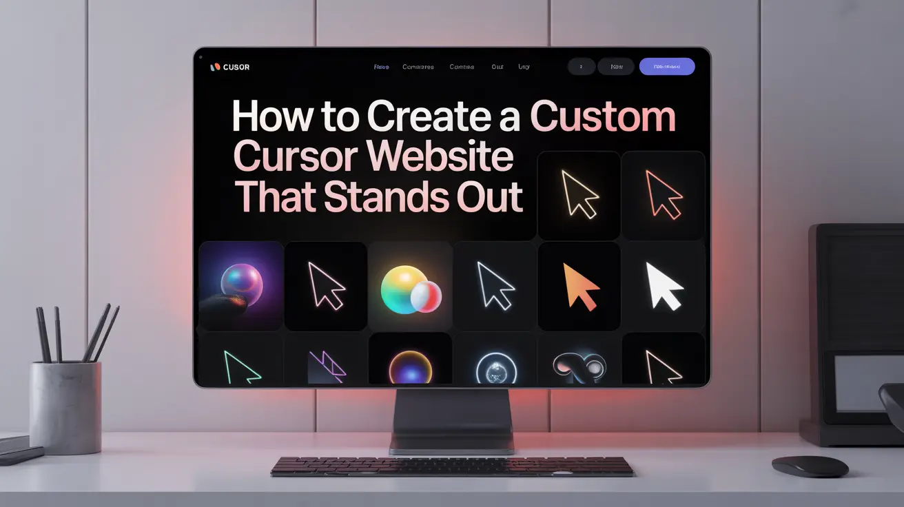
Keep the shape simple so it stays visible on any background. A dot or a thin ring works for calm brands. A thicker ring suits a playful tone. Pick one accent color only and reuse it across links and key actions.
Changing color on hover is fine, yet avoid glow and shadow together. One effect is enough. Keep choices consistent with your core design principles so the cursor reinforces brand tone, not distracts from it.
Users rely on cursor cues. Preserve the standard text beam in text areas so selection feels normal. Keep the default hand on links if your design already signals a click. If you replace it, make sure your custom state reads as “interactive” at a glance.
Do not hide the system cursor inside inputs, maps, or code blocks. People need precision there. Reuse familiar interaction patterns so the custom state reads as “interactive” at a glance
Some users ask for less motion. Honor that. Add a quiet mode that removes trailing effects and keeps a steady dot or ring. Keep contrast strong so the cursor never disappears on light sections or dark sections. Test with zoomed pages so the shape stays crisp at higher scale.
Long articles and docs need a quiet cursor. Turn off large animations on text-heavy pages. Keep the base state small while reading and enlarge only near buttons or media. This balance lets people stay in flow while still noticing key actions.
Two states cover most needs. A base state for normal movement and a clear “active” state near links and buttons. Growing the ring slightly or changing color can be enough. Resist building many states for small differences like “card hover” versus “chip hover.” Too many states feel extravagant and increase maintenance.
Heavy effects can make the site feel sticky. Ask your team to test on a normal laptop and a mid-range phone. Scroll a long page while moving the cursor. If frames drop or the cursor lags, simplify the effect. Shorter transitions and smaller shapes usually fix it. WebOsmotic treats performance as a launch blocker, not a nice-to-have.
Some visitors will not support fancy effects. That is fine. Set a clean default for them. If the custom style fails to load, the cursor should still look normal and clicks should still feel precise. Design for the lowest capability first, then layer the nice extras.
Add a simple “Reduce effects” toggle inside site settings. Store the choice so the site stays calm on the next visit. This small detail shows care and lowers bounce when visitors prefer a lighter experience.
Ask two people to do one action like “open the product gallery” or “start checkout.” Watch if the cursor helps or gets in the way. If they chase the dot or miss the link, the effect is too loud. Tweak size and timing, then test again. Small changes pay off fast.
Launch on two pages first. Monitor session replays and support chats for a few days. If people scroll smoothly and click confidently, expand to a few more pages. Keep a feature flag so you can turn the effect off without a full release.
WebOsmotic uses the same approach for any visual upgrade: small slice, honest metrics, calm scale-up. Most custom cursfor websites launch on two pages first, watch the metrics, then expand with a feature flag
Track a tiny set that anyone can read. Look at click-through on key links and time on page. Watch for rage clicks or quick back presses. If those rise after launch, lower the motion or reduce size. When the numbers hold steady and people explore more, you have a win. Your goal is a calm, fast experience that feels like the best custom cursor website for your niche, not a toy.
If the cursor hides content, shrink it and raise contrast. If users miss clicks, restore the standard hand on links or make the active state stronger. If pages feel slow, shorten animations and remove trails. If support asks spike, add the settings toggle and calm the effect on text pages.
You want a custom cursor that looks on-brand, works on real devices, and never hurts speed. WebOsmotic designs two styles, wires safe fallbacks, and respects motion settings. We test on phone and laptop, measure before and after, and keep a kill switch for emergencies. You get delight without drama and proof you can show in a review.
A custom cursor should guide and reassure. Keep the design simple, keep motion light, respect user settings, and roll out carefully. Are you planning to blend design taste with engineering discipline? Contact WebOsmotic and share your brand file and the two pages you want to start with. We will make it feel clean and keep it fast.


