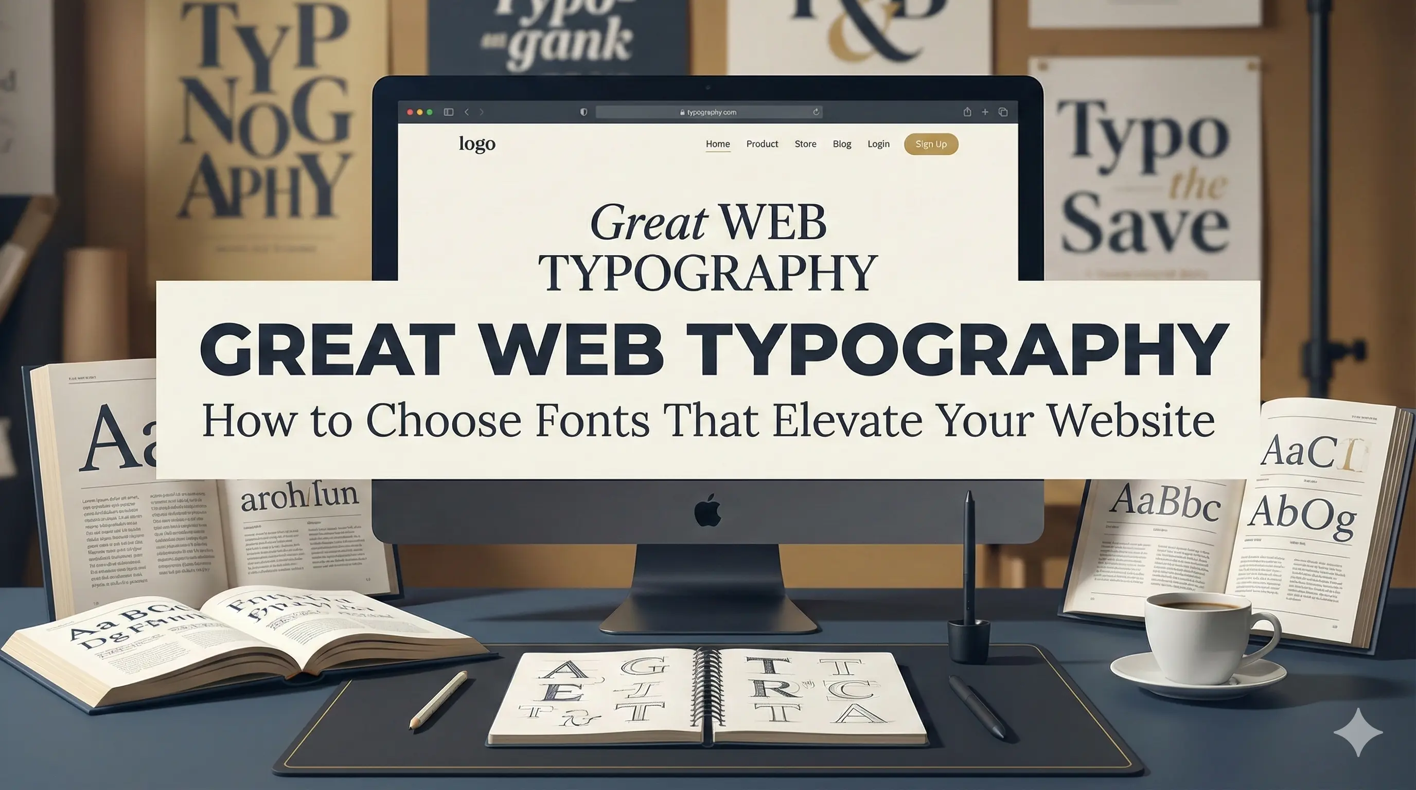
Great Web Typography: How to Choose Fonts That Elevate Your Website
185 Views
Summarize Article

Summarize Article
Visitors often decide to stay or leave in a few seconds. Fonts play a quiet yet strong part in that choice. One review of design research notes that professional, well picked fonts can improve user experience by up to 40 percent.
Many studies show that typography shapes how users feel about trust, quality, and personality on a site.
So great web typography is not an art project. It is a simple way to make content easier to read, clicks easier to take, and your brand easier to remember. Let us break it down in clear steps.
Text is the main interface on many sites. Buttons, menus, tables, and long articles all rely on readable fonts. Good typography supports three things.
A 2025 poll of 2,000 U.S. adults found that Americans believe only about 41 percent of what they see online is accurate and created by a real human, so calm, readable typography becomes one of the quickest signals that a page is honest and well made
UX guides and design systems treat typography as a core part of usability and accessibility, not a final layer. When you design great typography web design, you give every word a better chance to do its job. For anyone who wants to zoom out beyond type and look at the full surface of an interface, this visual design in UI and UX article gives a wider frame.
You do not need a degree in type design. A few basics carry most of the load.
Sans serif fonts work well on screens because they stay clear at many sizes. Serif fonts can still shine in headings or long reading blocks when contrast and spacing are set with care.
A simple rule for designing great web typography is that you are on the right track, if a user can read a full screen on a phone without squinting or zooming.
Fonts speak before visitors read a single word. Clean geometric sans fonts feel modern and calm. Humanist sans fonts feel friendly. Strong serifs can feel classic or formal.
To pick fonts:
Avoid extreme novelty fonts for core content. They can work in a logo or one big banner, yet they tire the eye in long paragraphs. For a strong typography design website project, you want fonts that help users, not fonts that shout at them. Still shaping the overall personality of your product? This UI UX design blog can help connect font mood to broader UX goals.
Many sites fail on size. Text looks fine on a studio monitor but turns tiny on a laptop or phone.
For website typography sizes, a good starting point is:
Line height should stay a bit taller than print. Values between 1.4 and 1.6 often feel comfortable for most body text.
Remember to test in real browsers. What looks perfect in a design file can feel cramped once real copy and UI elements surround it. When you plan the next redesign, it helps to see how current UI and UX design trends for 2025 treat type scales across desktop and mobile.
Font pairing can feel scary, yet simple habits help.
Look for families with many weights, such as light, regular, medium, and bold. A single flexible font family often beats three different fonts. It keeps load light and gives you enough range for hierarchy.
If you feel stuck, start with one font family that has a strong regular and bold. Use bold for headings and regular for body. Add a second font only when you know what gap it will fill.
Even the best font fails when spacing is wrong. Three levers matter most.
Lines that run too wide slow people down. Lines that stay too short feel choppy. Many guides suggest 40 to 80 characters per line for body text.
Leave enough space between lines and blocks so eyes can rest. White space also helps users see groups of related content, such as a heading with its paragraph.
Use size, weight, and colour to show which bits are most important. H1 and H2 headings should stand out. Links and buttons should not look like body text. A clear hierarchy makes scanning easy and supports users who read in a second language.
Typography and accessibility go hand in hand. Poor contrast, and tiny text lock people out.
Key checks:
Good accessible typography helps users with low vision, dyslexia, or attention limits. It also helps tired people late at night. Type is one of the fastest levers to move for teams that care about inclusive design.
You cannot judge typography only in a static mockup. You need to see how it behaves with live content.
Try this quick test plan:
Check analytics too. Pages with good typography often show lower bounce and higher scroll depth because people find reading pleasant.
Small tweaks can give big gains. Adjust website typography sizes, line height, or contrast, then compare metrics over a short period.
WebOsmotic works with product and marketing teams that want their sites to feel calm and readable. The goal is not to chase fashion. The goal is to make every word easier to consume.
Typical work includes:
When those patterns are ready, you can refine them further with layout tweaks and small CSS adjustments using ideas out of this modern web design CSS guide.
When WebOsmotic builds or refreshes a site, typography sits inside a full system that covers layout, colour, and accessibility. AI tools can help compare options and catch contrast issues, yet humans still pick the final style so the result matches brand tone.
Great web typography is quiet. Users notice it when it is missing, not when it is working well. With a handful of clear rules on font choice, you can turn hard to read pages into smooth journeys.
Do you want help reviewing your current setup? WebOsmotic can run a quick typography check, and suggest a simple scale. We’ll guide your team through updates. Step by step, better type can make your site feel clearer, and more trustworthy. Your website will be much easier to use for every visitor.

