Is Dark Mode Website Design Good for UX and Conversions?
125 Views
Summarize Article

Summarize Article
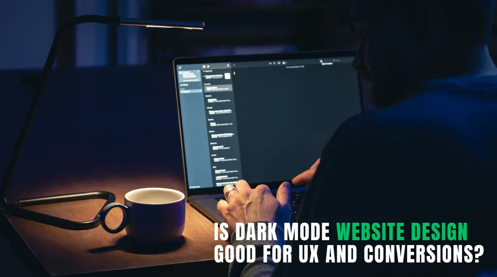
Dark mode is now trending in various designs for improving the aesthetic appeal of the interface. Many public resources have asked questions to know how much people love dark mode in interfaces, and the comments are always full of positivity.
Dark mode has the potential to enhance concentration, create a visual glare in particular environments, and elevate a brand to a higher level.
However, not always dark mode can be the right choice. Some platforms aren’t meant to have dark themes due to its experience. For example, reading with large blocks of text.
So, what’s the best way to adapt dark mode website design?
This article breaks down where dark mode works and how to decide if it is good for UX and conversions.
There are some reasons as to why the dark mode website design continues to emerge among contemporary websites.
First, it feels current. Dark interfaces can be perceived as cleaner, cinematic and more tech-forward than light interfaces. Brands desiring a high-end, assertive, or futuristic image usually drive towards it.
Second, dark interfaces have already become popular among many users with apps and devices. When a site is appropriate to that visual setting it can be familiar.
Third, dark designs can accentuate colors, gradients, and pictures. That is why lots of best dark mode website designs get attention at the first sight. Contrast can be strong to bring out a dramatic effect which is quickly noticed.
Nevertheless, attracting attention is not synonymous to leading a conversion. If you want a broader context on what is actually working now, web design trends helps you compare dark mode against other UX patterns.
Dark mode may be beneficial to UX in the appropriate place.
A bright white screen is disagreeable in a low-light environment. Dark mode can be less stressful to those who are browsing in the dark or operating in dim environments.
Dark backgrounds in dashboards, video platforms, gaming sites, and portfolio designs that feature heavy designs tend to do well because the visual content is moved forward. Charts, interface panels and media can seem more hewn-up and simple to read.
Dark mode can be used to help uphold the intended tone of the brand (especially with luxury, entertainment, AI, SaaS, and gaming brands) compared to a bright layout.
However, these strengths would be useless in case the page would remain readable and user-friendly.
Many other websites use dark mode as it is fashionable in prototypes. Then the real life experience is tiring.
In some cases, dark backgrounds and light texts may cause visual fatigue to the user when used on large blocks of text. The glow effect on bright texts on dark backgrounds is also something that may make it less comfortable to read long.
Other designers do not use pure white on black, which is intelligent though then they use gray-on-gray combinations that appear graceful and are not readable. Lack of clarity of headings, body text and labels reduces understanding.
It is frequently simpler to distinguish between sections, cards and controls on light backgrounds. The designers have to have greater discipline of spacing, borders, shadows and contrast in the dark mode. Otherwise, pages are two-dimensional and more difficult to browse.
Yes, the trends of website design in dark mode are a reality, but the value of trends is not sufficient. For practical readability and hierarchy rules that reduce fatigue, great web typography is a useful article here worth reading.
Conversions are reliant on clarity, trust and momentum. Dark mode may aid all the three, yet it may undermine them as well.
Here is a practical way to compare where dark mode tends to help and where it often creates friction:
| Area | Dark Mode Can Help | Dark Mode Can Hurt |
| Brand perception | Feels modern, premium, bold | Can feel too niche or overly aggressive |
| Visual focus | Highlights images, UI panels, media | Can flatten layouts if contrast is weak |
| Readability | Works for short sections and dashboards | Can strain eyes in long text blocks |
| CTA visibility | Strong buttons can pop well | Poor contrast makes CTAs easy to miss |
| Trust and clarity | Good for polished, high-end experiences | Can feel less transparent for pricing or service pages |
This is why some of the best dark mode website designs are not fully dark everywhere. They use dark mode where it helps and lighter sections where clarity matters more.
Not every site should push dark mode equally.
Dark mode often works well for:
It often needs more caution for:
These categories often depend more on clarity, transparency, and easy reading than visual mood.
A strong dark site is not just “black background plus white text.” It follows a few practical rules.
Good dark designs use soft dark tones, not always pure black. They also choose text colors carefully so reading stays easy.
Buttons need strong contrast and enough whitespace around them. If the main CTA does not stand out in three seconds, the design is not helping conversion.
Spacing, borders, hover states, and elevation matter more in dark mode because everything can blur together if surfaces are too similar.
Dark forms can feel intimidating if fields, labels, and buttons are visually dense. Clean spacing and clear labels matter a lot here.
A dark mockup may look great in Figma, but live users might struggle with text, forms, and mobile readability. Real testing is what separates design taste and design performance.
If you want a dark theme that stays conversion-friendly, WebOsmotic’s UI UX design services helps you build the interface of your choice.
In many cases, yes.
A toggle gives users control, which is often the smartest answer. Some people love dark mode. Others find it tiring, especially for reading-heavy pages.
A toggle is especially useful if:
For many brands, the best answer is not choosing one mode forever. It is letting users choose.
Dark mode may be highly beneficial in terms of UX and conversions, but only when it is used in the appropriate context and is implemented with great attention. It is most appropriate when it favors the brand, maintains readability of the contents, and the next action seems intuitive. It collapses when style turns out to be more significant than clarity.
The intelligent solution is therefore straightforward: whenever dark mode can make users more focused and allow them to act faster, they should use it. Shield it, make it less intense, or provide an option where it is more important to read and trust than dramatic appearance.


