Why Dark Background Apps Are Winning in 2026
94 Views
Summarize Article

The dark background app has gone from side option to default choice for many users. People open a dark background app for chats and tools because bright white screens now feel tiring and old. They want softer light, longer battery life and cleaner focus on the main task.
Product teams want the same thing plus a modern look that fits 2026. WebOsmotic sits right in the middle of this shift, designing apps where dark UI is a smart starting point, not an afterthought.
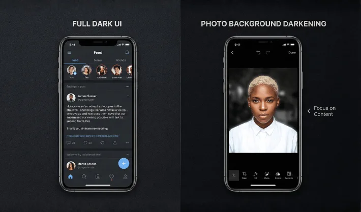
When people say “dark mode” they often mix two ideas. One is the full product interface. Menus, content cards and toolbars stay in deep grey or pure black. The other idea is more focused. It is an app to darken background of photo or layouts, so the subject stands out clearly.
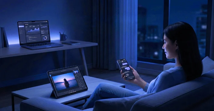
Both ideas use the same simple rule. Keep most of the screen quiet and bright parts only where the eye should land. WebOsmotic uses this rule in dashboards, mobile tools and browser products so teams get apps featuring dark backgrounds that still feel friendly and open, not heavy.
87% of people keep their smartphone in the bedroom and 45% use it when they can’t fall asleep. Hence, the reasons sound simple, why dark screens are preferred more.
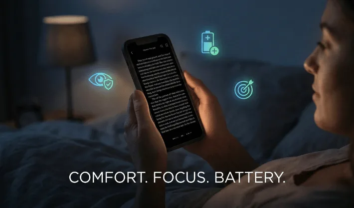
A pale screen in a dim room hits the eyes hard. A dark app background keeps overall light low and still holds clear contrast for text and icons. People can scroll longer without that sharp sting. The AAO discusses digital eye strain and gives practical tips like reducing screen brightness and glare.
On many modern displays, black pixels draw less power. Users do not run tests, they just feel that the phone lasts longer when they pick apps featuring dark backgrounds for heavy tasks like chat and browsing. Darker UIs use less energy than bright white ones.
When most of the UI is dark, your attention jumps to the bright parts. Messages, photos and buttons sit in a calm frame. You react to what matters instead of fighting screen glare.
For teams that work with WebOsmotic, these user wins turn into product wins. Less fatigue means fewer rage quits and better reviews. Users stay inside the app for longer sessions and feel good about coming back.
One simple way to pull focus to key content blocks is to pair quiet surfaces with apps featuring dark backgrounds that naturally frame the main action
Here’s another big trend is visual content. Creators want simple tools that tidy busy images before they hit a feed. Here, the darken background app plays a quiet yet powerful role.
People use apps to darken the background when they:
Good apps to darken the background do three things well. They auto detect the subject, they offer smooth sliders instead of complex panels and they let you save presets so every post keeps the same style. WebOsmotic often bakes these flows into custom creator tools, so brands control the full pipeline from camera to post without wrestling with heavy desktop software.
Not every dark design feels right. Some apps look muddy or too flat. Strong execution matters.
A good dark experience usually has:
Backgrounds sit in rich black or deep charcoal. Text uses soft off white so it stays readable. Accent colours stay limited and clear so the screen does not shout. Also check this recent study on how dark color schemes lower device energy consumption.
Crowded layouts feel worse in dark mode than in light mode. Buttons and cards need enough breathing room. WebOsmotic often pushes teams to remove one or two extra elements so the design can breathe.
Light shadows or subtle blur panels show which layer sits on top. You feel depth without thick outlines. Tiny motion on open and close helps the eye track changes without feeling dizzy.
When a dark UI hits these marks, people stop thinking about “mode”. They just feel that the app is easy to read and easy to live with.
With so many options, it helps to test apps with your own routine instead of trusting only screenshots.
First, install the tool and use it for one full evening. If your eyes feel calmer at midnight than they do with your old app, that is a strong sign. Try the same app the next day in the sun. Text should still stay clear and sharp on a bright street.
Second, test performance. Heavy effects can slow older phones. Scroll tall pages, open and close menus, edit a few photos. A good product feels quick on mid range devices too. WebOsmotic often profiles screens on several real phones during design sprints for this exact reason.
Third, check how the app fits with your wider stack. If you already use one dark background app for notes and another for team chat, a third tool with a very different style may feel jarring. Try to build a small group of tools with similar rhythm so your eyes and hands stay relaxed through the day.
Dark layouts are not just a trend. They match how people really use screens now. Users scroll late at night, work on bright streets and shoot more content on phones than on any other device. A smart dark design keeps eyes comfortable, lets the battery breathe and puts focus back on the message instead of the glare.
If your product still treats dark mode like a side project, this is the moment to bring it to the front. With WebOsmotic as your design and development partner, you can ship apps featuring dark backgrounds that look sharp, perform fast and feel good to live in every single day.
Are dark background apps always better for the eyes?
They usually feel softer at night and in low light. In bright sun, some people still prefer light mode. The best setup lets you switch quickly based on your space.
Do apps featuring dark backgrounds always save battery?
They often help on OLED and AMOLED phones because black pixels draw less power. Gains vary by brightness level and usage, yet many users notice extra life by the end of the day.
What should I check in a darken background app for photos?
Look for clean subject detection, smooth sliders and export quality. Edges should look natural, and the subject should stay sharp while the background darkens without obvious halos.
How can WebOsmotic help teams build better dark interfaces?
WebOsmotic designs and ships products with dark first thinking. The team mixes UX research, UI craft and front end build so your app looks modern and still feels kind in real users’ eyes.


