Best Digital Product Design Process: Expert’s Guide
119 Views
Summarize Article

A strong design process is not art by luck, it is repeatable work that shows up in numbers. Teams that invest in UX also see hard payback: multiple summaries of Forrester’s research report a $100 return for every $1 put into usability and experience.
Regular user testing cuts build waste by catching issues early, which lowers development cost and speeds release. Another survey has also shown big KPI lifts after usability work, with average improvements reported in past studies.
It is a loop. Learn out of users, design with purpose, test in small slices, and ship improvements on a schedule. The loop protects you when plans shift and keeps teams aligned when pressure rises. You do not need fancy terms to do this well. You need steady steps and honest measures.
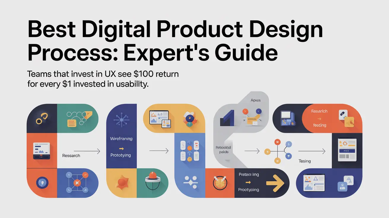
Below are the digital product design process steps we use with clients. Start at Step 1 and keep the loop tight.
Write one sentence that names the user and the win they get. For example, “Freelancers can create an invoice in under two minutes with no template hacks.” Add one test that proves success, like “time to first invoice is cut in half.” Keep this pair at the top of every doc so every choice lines up with it. Kick off with a short, no-fluff product discovery workshop to align goals and success metrics.
Talk to a few users in short calls and watch a couple of real sessions. Read support notes and sales notes to see patterns. Capture what hurts today and what result they want in a single page. Skip long decks. A short note gives your team enough to move.
Translate the promise into a tiny spec that both design and engineering accept. State the main job, show the two guardrails that must hold, and include a picture of the key flow. Guardrails could be “works offline” and “no personal data stored on the device.” Two is enough for a first pass. You can add more later as you learn.
Draw the path for the two tasks that deliver the promise. In the invoice example, that is create invoice and send invoice. Keep shapes simple and arrows clear. If one box needs a long note to explain it, the task is too big. Split it so each step stays obvious. For mobile-heavy products, borrow proven patterns from tables best practice for mobile UX design.
Sketch the screens in black and white and focus on layout. Put actions near the thing they change and keep the main button where it is easy to see and tap. Share the draft with two users and one engineer, then fix rough spots the same day. Fast feedback beats perfect lines. Keep visuals calm and readable using the rules in this guide.
Build a clickable path that proves the flow. Do not chase polish. Load it on a phone and a laptop to check touch targets and spacing. Ask two users to finish one task without help and time them. If they get stuck, fix the biggest snag and test again. Do not add features until this path feels smooth.
Once the flow works, add a small style system. Pick a simple type scale for headings and body and a clean color pair for actions and alerts. Add components only when the screen truly needs them. Buttons and inputs usually cover early screens. Hold off on modals until later. This order keeps focus on decisions, not decorations.
Use plain words. Replace vague labels like “Submit” with verbs that match the action, such as “Send invoice.” Design empty states that teach and error states that guide the next step. Clear states lower support load and build trust faster than any banner or tooltip.
Schedule short sessions with two users on the same task. Watch without jumping in. After each run, ask what helped and what hurt. Fix the highest impact issue first and ship the change. A weekly rhythm prevents big misses and keeps momentum steady even when deadlines get loud.
Treat handoff as a working session, not a file dump. Share a spec that covers sizes, spacing, and tokens, then walk through the key flow and one tricky state. Keep an open thread for questions so decisions stay visible. Builds move faster when everyone can see the reason behind each choice.
Sit together for the first slice. Short feedback cycles beat long tickets. Designers adjust spacing and empty states while code is fresh. Engineers point out edge cases while changes are still easy. This feels like an in-house team and keeps rework low.
Release to a small group first. Track a simple pair of numbers, like task completion rate and time on task. Add a one-line survey at the end that asks, “Did this do the job you came for.” If many say no, read their notes and change one thing at a time. Measure again before adding new ideas.
When parts repeat across screens, turn them into tokens and components. Start with spacing and color tokens, plus buttons and inputs. Document use on one page with a clear example and a counter-example. Designers move faster, engineers reuse with confidence, and reviews get shorter.
You want a partner that designs, tests, and ships without drama. WebOsmotic does three things well:
We also integrate with your build rhythm. If a sprint needs a fast vector of help, we slot in. If a review needs evidence, we hand over clips and notes. Calm, steady, accountable.
Start with the promise and a success test. Wire the smallest path that delivers it. Prototype and check two users, and fix the largest snag. Then add color, states, and a system you can reuse. If you want a team that runs this loop with care and speed, bring WebOsmotic your product and your metric. We will help you ship work that users understand on the first try.


