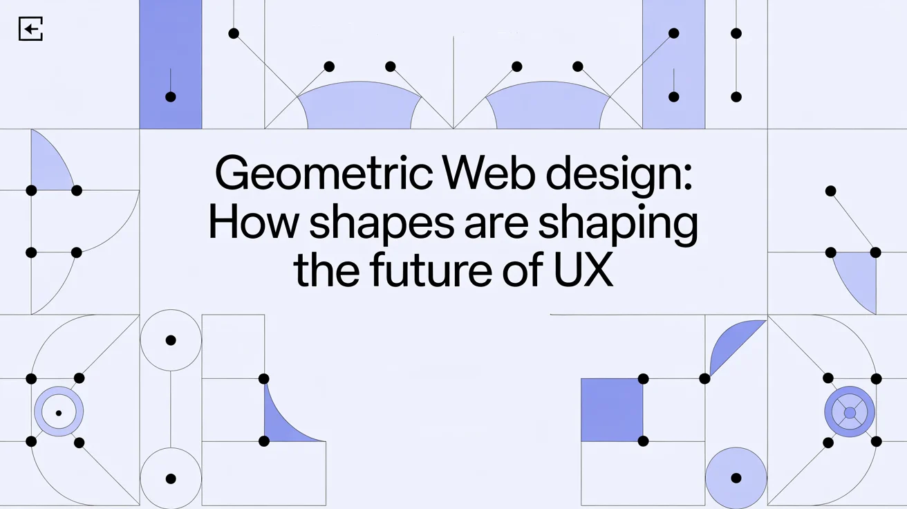
Geometric Web Design: How Shapes Are Shaping the Future of UX
220 Views
Summarize Article

Summarize Article
Shapes guide the eye, set rhythm, and signal action. Squares build structure, circles focus attention and feel friendly, triangles add direction and energy. Use a clear grid, a small set of shapes, and gentle motion so screens feel stable, readable, and quick.
You might worry that geometry will make pages feel cold. It will not, as long as shape choices match brand voice and help people do real tasks faster. Geometry creates a shared visual language, so layouts feel intentional and people navigate with less effort.
In a recent Adobe study, designs featuring balanced geometric shapes boosted user engagement by 23% and improved user retention by 15%.
Humans read shape faster than text. A circle groups, a square frame, a triangle points. When that language stays consistent across pages, people learn once and carry that knowledge across the whole site. The result is calmer scanning, fewer hesitations, and smoother paths to action.
A grid sets columns, gaps, and a steady spacing unit. Content snaps into place, which removes guesswork during design and build. Pick a column count that suits your content, then keep it steady across breakpoints.
Choose a base unit, like 4 or 8, and reuse it for margins, padding, and line height. When a dense dashboard and a simple landing page both sit on the same grid, the product feels related even when sections look very different.
According to an Adobe survey, 66% of designers consider organic shapes to be a major emerging design trend.
Most cards, panels, and modals resolve into rectangles. They suggest order and reliability, which helps in areas like pricing, product grids, or file lists. Keep corner radius consistent by size class so small chips and big tiles look like relatives.
Give titles a strong top line, group meta details in a calm middle, and reserve a tidy bottom zone for actions. Square image frames keep edges even in lists and help rows feel balanced on any screen width.
Circles feel friendly and pull attention inward. They work well for avatars, key metrics, and primary touch targets on mobile. Use circles when an element represents a person or a single value, and keep strokes even so edges do not wobble on hover.
Large circles deserve restraint. A small scale-up on press can confirm a tap or click landed, while a huge bounce will steal attention without adding clarity.
Triangles point, so they are perfect for cues about movement and priority. Chevrons can signal drill in, small carets can hint at reveal, and trend arrows can show change at a glance.
Keep arrowheads consistent so a right-pointing mark always means go forward. Scatter too many sharp angles and the page starts to buzz, so use triangles with purpose, not as decoration.
Geometric patterns can give a brand a unique texture, yet content must win the foreground. Use low-contrast motifs behind wide sections and fade them near headings or buttons.
Align tiles to the grid so seams vanish. Scale patterns with breakpoints, since large screens can carry bigger tiles while small screens benefit more from plain areas that keep text crisp.
Type is shape. Treat headings and paragraphs as blocks that sit on the grid. Build a type scale out of a simple ratio, then map sizes to the same spacing unit used in the layout.
Aim for headings that form tidy rectangles and lines that end cleanly, so eyes travel without stutter. A geometric sans can carry headings, while body text can stay human and relaxed as long as roles are clear.
Icons are tiny geometry lessons. Keep stroke width, corner radius, and angles consistent so a set feels like one family. In charts, shape carries meaning at a glance. For chart clarity basics, see what is data visualization. Circles can mark counts, squares can group categories, triangles can show change. Do not rely on color alone. Pair shape with labels so people with limited vision read data with confidence.
Great navigation uses shapes to signal place and path. A narrow rail of square icons with labels can keep sections stable.
A simple stepper with circles and connecting lines can show progress during checkout without extra text. Breadcrumbs shaped as neat blocks help people hop across levels without guesswork. When shape cues stay steady, users stop scanning and start acting.
Thumbs need room, so circular or rounded targets shine here. Keep important actions in easy reach, group related controls into balanced blocks, and increase spacing slightly in crowded areas so taps land cleanly.
Cards that stack into neat rectangles, plus crisp circular avatars or badges, create order on small screens without heavy chrome.
Access lives inside shape choices too. High contrast between blocks and text keeps reading easy in bright light. For palette and contrast basics, see colors in UI design. Focus rings need visible outlines that stand clear against backgrounds and components.
Shape plus label beats color alone for status and chart marks. If motion appears, provide a calmer path for people who prefer reduced motion. Geometry can guide access in a way that feels natural, not bolted on.
Geometry should not slow a site. Keep vector art light, avoid giant background images with heavy patterns, and reuse shape tokens across components so CSS stays small.
Subtle motion can run on transform and opacity for smoother frames. The goal is a visual language that looks clean and loads fast, even on modest devices.
A brand can speak in curves or angles. Soft circles and rounded corners can feel warm, sharp triangles and tight grids can feel bold.
Pick a small set of shapes that match the tone you want, then use them consistently across pages, illustrations, and data views. Write those choices into your design system so teams do not improvise on every screen.
Some teams fear sameness. That risk appears only when choices copy trends without a house style. Define a signature set, like square cards with a subtle 6 pixel radius and circular avatars with a thin ring, then use that set across the product. Others worry about decoration that hurts legibility.
The cure is simple: keep patterns out of text blocks, soften contrast behind content, and reserve bright angles for cues that signal action. A final doubt concerns human warmth. Geometry can feel warm once type, spacing, and motion add rhythm, and once shape choices support real tasks instead of pulling attention away.
Geometric web design is not about adding trendy patterns. It is about a clear grid, a small set of shapes, and motion that respects both. Squares build structure, circles focus attention and add a human note, triangles guide direction.
When that language stays steady, pages read faster, wayfinding feels natural, and the product gains a calm confidence. Start with one page and one goal, tighten the grid, choose your shapes, and let that choice ripple across components. Small, consistent steps will reshape the whole experience. Want a shape-driven design system audit? Explore our UI/UX design services.


