Modern App Colors: Design Palettes That Work in 2026
270 Views
Summarize Article

Open any new product in 2026 and you feel it in seconds. As of 2024, about 81.9% of smartphone users and 82.7% of desktop/laptop users prefer dark mode.
Modern app colors are calmer, deeper and more focused on function than loud gradients of a few years ago. The right modern app colors help users read faster, tap with confidence and trust the brand behind the screen.
WebOsmotic works with teams that want that balance.
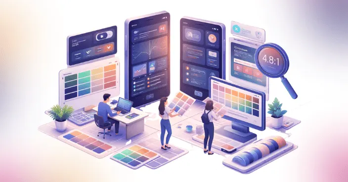
A modern app color palette is not only about trendy shades. It respects eyes, context and brand. A few patterns show up across strong products.
Instead of ten random hues, you see a small set of colors used with intent. WebOsmotic often starts with grayscale, then adds accent layers only when a screen truly needs them. That keeps the modern app color scheme clean and easy to scale.
You can also revisit the basics of visual design in UI and UX to see how color, layout and hierarchy work together on each screen.
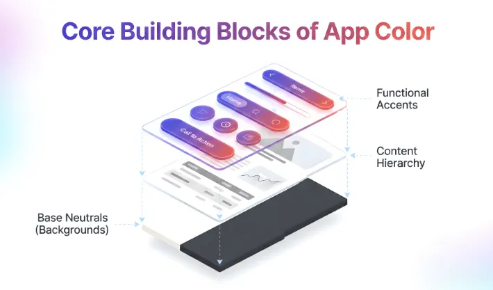
When you plan modern app color schemes, think in roles, not just hex codes.
Once these roles are clear, you can build many modern app color palettes without losing structure. WebOsmotic locks these roles in a design system so new screens never ask “which blue today”.
If you are planning layouts at the same time, our guide on responsive versus adaptive design shows how colors behave as screens shift across devices.
Let us look at a few quick models that show how a modern app color palette can feel fresh and practical.
This fits tools, finance apps and dashboards. It keeps trust high and still lets charts and buttons stand out.
This works for media, chat and productivity apps that run long hours. It pairs nicely with dark background trends you already see in many modern color schemes app examples.
This suits lifestyle and retail products that want a little personality without tiring users.
WebOsmotic often tests these options on real content instead of empty layouts, so teams see how numbers, names and long labels behave in each modern app color scheme.
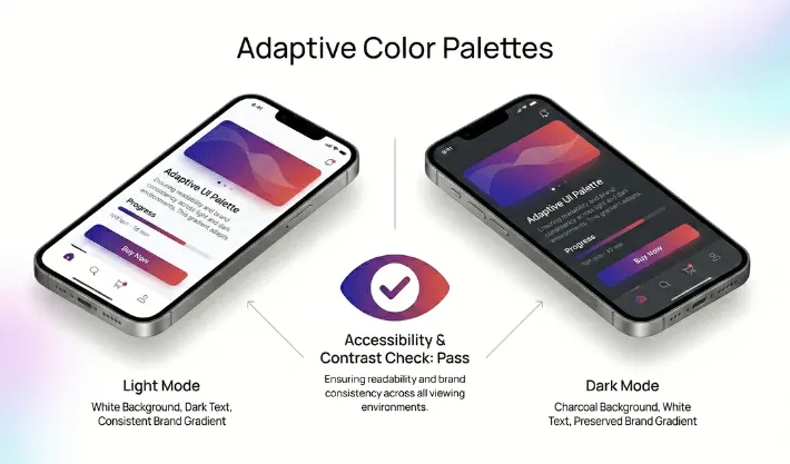
For normal text, the minimum contrast ratio is 4.5:1, and 3:1 for large text; these ratios account for low vision and color deficiencies.
Modern design has to work for more eyes, not fewer. That means checking contrast and states. If text sits on a colored surface, there must be enough contrast for people with weaker vision or low end screens.
Good modern app color schemes reach contrast targets on primary text and key controls. Labels on buttons, inputs and chips stay clear in day and night mode. Error states use more than color alone. Icons and short text help people with color blindness see what went wrong.
For a wider view of inclusive products, you can look at universal and accessible design principles that sit behind strong contrast choices.
WebOsmotic bakes contrast checks into design reviews so teams do not ship layouts that look fine on one bright monitor yet fail on phones in daylight.
Choosing colors can stall a project. Here is a simple flow that keeps it moving.
During this work, avoid chasing every modern app color palettes trend you see online. Most strong apps pick a lane and stay with it for long periods. WebOsmotic helps founders choose colors that will still feel right in two or three years, not only during launch week.
Color is part taste, part system. WebOsmotic mixes both sides. The team will:
You end up with modern app color schemes that look consistent across web, mobile and marketing pages instead of three separate identities.
Color in 2026 is less about loud tricks and more about clear roles. The right choices help people read, decide and act quickly while still feeling that your product has its own tone. Modern app colors should protect eyes, support contrast and express brand in a calm, steady way.
Do you want a partner who can turn vague mood boards into a solid modern app color palette? WebOsmotic can help you design, test and roll out schemes that look good today and stay stable as your app grows.
How many colors should a modern app color palette use?
Most strong products use one or two main neutrals, one accent and a small set of state colors. Too many hues create noise and make updates harder.
Can I reuse our marketing brand shades inside the app?
Yes, if they pass contrast checks and do not hurt long reading. Often WebOsmotic tweaks saturation or brightness so brand color works in UI without tiring eyes.
Do modern color schemes app designs always need dark mode?
Not always, yet many users expect it now. If your app runs late at night or for long stretches, a well planned dark version is worth the extra effort.
How often should we change our modern app colors?
You do not need to change often. Small tweaks every few years are enough. Focus more on consistency and clarity than on chasing every yearly trend.


