Tables Best Practice for Mobile UX Design: Patterns That Work
443 Views
Summarize Article

Summarize Article
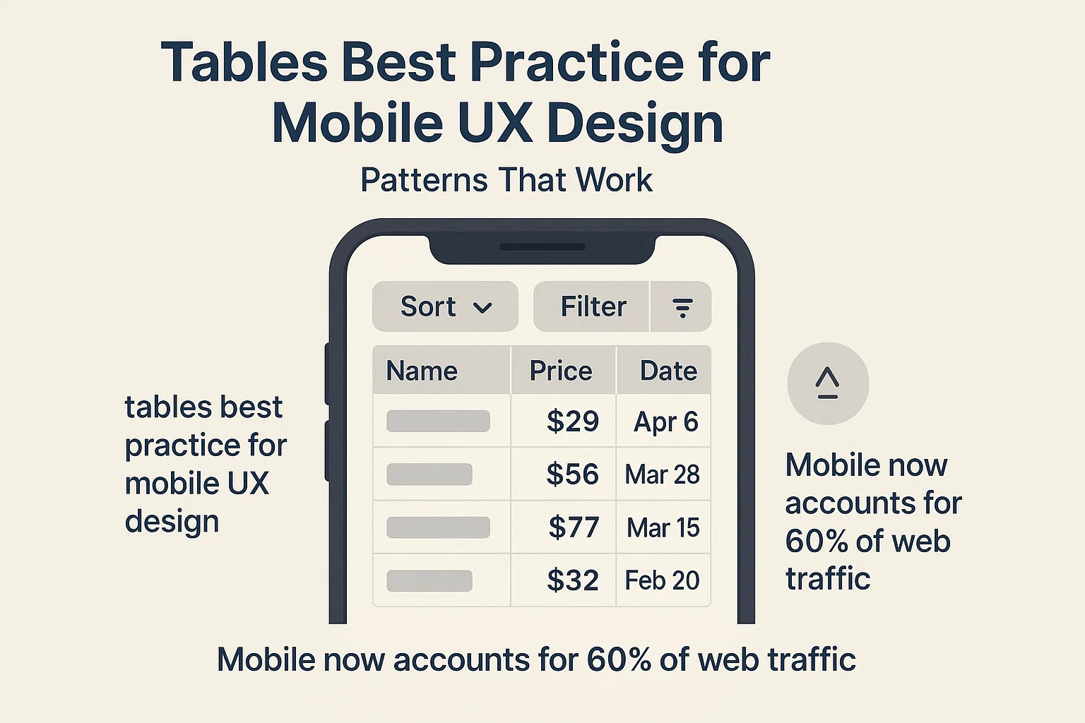
Tables on small screens work best when you show only the fields that help a person decide, then reveal the rest on tap, with clear sort and filter controls near the top. The goal is speed and trust, not a tiny replica of a desktop grid.
Learn about practical layouts you can try this week. To anchor SEO, you will also see the exact phrase tables best practice for mobile ux design used once in context.
And you know what, mobile now accounts for 60% of web traffic. So, it’s literally worth reading further!
A phone screen puts pressure on width, precision taps, and reading flow. People still need to scan many rows, compare two or three values, and act without guesswork.
That means density must rise a bit while clarity stays high. The trick is to lead with the one or two fields that drive action, then hide low-value fields until a tap reveals them.
Keep two key fields always visible, then allow a soft side scroll for secondary fields. Pin the row label on the left and the main action on the right, so the row stays usable while it slides sideways.
Why it works
Build tips
Turn each row into a tidy card where the title sits on top, the key metric sits large, and two small labels give context. A link or chevron opens a full detail screen.
Why it works
Build tips
Keep a compact row that expands right in place. The row doubles in height and shows extra values, plus a secondary action like “Share” or “Duplicate”.
Why it works
Build tips
When a row opens, show a clean key-value layout: short labels on the left, values on the right, plus a sticky action bar at the bottom.
Why it works
Build tips
Large lists gain speed when you group rows. Use day buckets or owner buckets with a slim header that repeats on long scrolls.
Why it works
Build tips
Place sort and filter controls right above the list. Use a single sort toggle that cycles through two states, not a complex picker. For filters, show selected rules as chips that can be cleared in one tap.
Why it works
Build tips
Skeleton screens improve perceived speed. A list without data still needs to guide action. Empty needs a small explanation and one button to add or import. Loading needs a skeleton that hints at length and shape. Errors need a short line in plain words and a retry.
Why it works
Build tips
Selection mode should be explicit. A “Select” button flips the list into a mode with large taps on each row. A sticky bar at the bottom shows Count and the main bulk action.
Why it works
Build tips
Avoid tight pagination controls. Phones work better with “Load more” that grabs the next chunk while keeping scroll position stable. If infinite scroll is needed, show a soft marker when a new chunk appears.
Why it works
Build tips
Tables often need column labels or a key action in view while users scroll. Pin a slim header that shows the active sort and the main filter state. Pin a small action bar only when the user selects something.
Why it works
Build tips
Tighten vertical spacing just a little, then lift line height so text breathes. Use a compact font weight for secondary lines and a bold line for the key value.
Avoid cramming every field into the default view, because speed drops when the eye hits dense noise. For summarizing dense info, see what is data visualization.
A small rule of thumb
Icons should carry one idea each and keep a steady stroke. Use color to mark status, yet always pair color with a word or badge, since not everyone sees color the same way. Contrast must meet sane targets so lists stay readable in glare. For palette and contrast choices, see colors in UI design.
Build tips
Phone UI needs large taps. Targets of 44 px or larger cut misses. Avoid burying core actions behind long-press or edge swipes that few people discover. If you add a hidden gesture, always offer a visible path to the same action.
Build tips
Step 1: list the top task and the two fields that drive it.
Step 2: choose grid-with-scroll or card stack based on that task.
Step 3: place sort and one key filter above the list with chips for active rules.
Step 4: add empty, loading, and error states that point to one next step.
Step 5: run a quick test with three users, then adjust spacing and labels.
Mobile tables do not win by squeezing a desktop grid into a narrow box. They win by putting the right fields in the right order, by giving clear controls near the list, and by revealing depth only when a person asks.
Start with one pattern and one list, measure a simple metric like time to find, then tune spacing and labels until the list feels calm and fast.
You will know you are close when people stop pinching, stop hunting, and finish tasks with quiet confidence. Want a senior review of your mobile tables? Explore our UI/UX design services.


