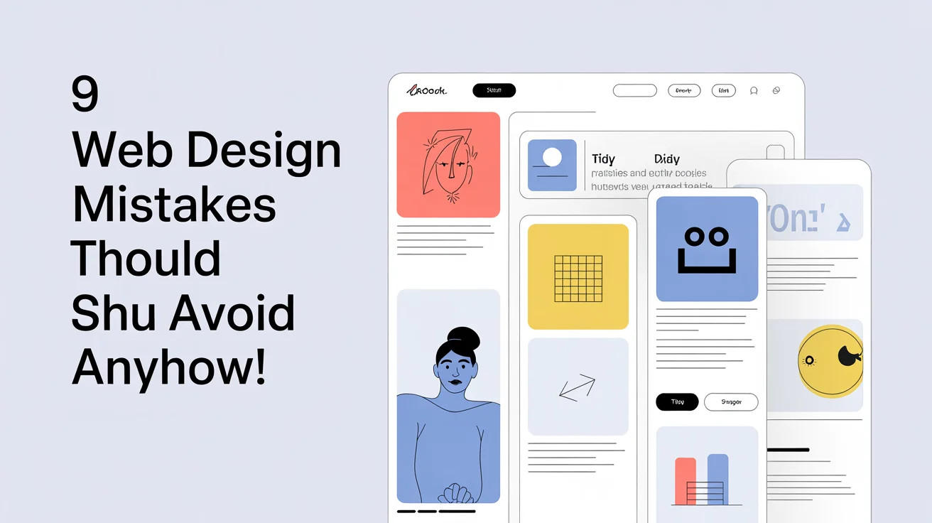
9 Web Design Mistakes You Should Avoid ANYHOW!
135 Views
Summarize Article

Most web design mistakes come out of unclear priorities and heavy pages. Fix the basics first, then tidy copy and controls so people see the next step without hunting. This guide keeps the talk plain and the moves practical, with a steady focus on web design mistakes you can remove this week.
You need to understand that trust grows out of clear structure and fast loads. A page that feels calm will beat a busy one even if the busy one looks fancy in a mockup. As you read, picture one real screen in your site, then apply each fix to that single screen before you touch anything else.
Speed sets the tone for everything that follows. If the hero image weighs a ton and scripts chatter on load, visitors bounce. Compress images, serve sizes that match the screen, and lazy-load media that sits below the fold. Keep a lean script budget and cut old libraries you no longer use. One lighter hero plus one removed widget can shave seconds off load time, which feels huge on a mid-range phone.
Try this: pick two busy pages, compress the top images, remove one unused script, then recheck load time the same afternoon.
When every element shouts, nothing leads. Each page needs one headline that states the point, one helper line for context, and one primary action that looks like the next step. Keep nearby links in a lighter style so they help without stealing focus. A pricing screen that highlights one plan and keeps the rest calm guides decisions without pressure.
Try this: rewrite the main button as a verb plus outcome, then tone down surrounding elements so the path stands out.
Small buttons punish thumbs and cause mis-taps. For tap targets, WCAG 2.2 sets a Level AA minimum of 24 by 24 CSS pixels, which directly reduces mis-taps on mobile. Set a sensible minimum target size, add breathing room around controls, and place key actions where a thumb can reach with ease. On mobile, steady padding and clear grouping make the page feel friendly. A modest bump in target size plus a little more space often cuts support pings about “I tapped the wrong thing”.
Try this: in one form, increase target size for primary controls and add space between stacked actions.
Pale gray on a pale background might look sleek in a mock, yet it strains eyes in real life. Raise contrast on body text, keep line length comfortable, and use one type family with clear weights so hierarchy comes from typographic rhythm, not visual tricks. A help article with solid contrast and tidy spacing holds attention longer than any fresh illustration.
Try this: open one article on your phone under bright light, then lift text contrast and size until reading feels effortless. For palette and contrast basics, see colors in UI design.
If visitors cannot reach checkout or contact in two taps, they bail. Keep nav short, label items in plain language people already use, and avoid vague buckets. Add search where it truly helps and make results feel relevant. In long menus, put the top two links first and tuck niche items into a secondary view. Good nav turns wandering into progress.
Try this: watch one person try to reach a key page, rename the link that slowed them, and move it higher.
Long forms with unclear errors drain energy and trust. Cut fields that do not serve the task at hand. Use two steps only when the task splits cleanly. Validate as people type and place help right next to the input that needs it. Auto-fill standard data so nobody retypes basics.If you ask for a data field, show how it helps right now. Clarity turns friction into flow.
Try this: remove one optional field you never use and add inline error text to the field that causes most mistakes.
Access is a baseline. See our guide to web accessibility in website development. People use screen readers and keyboards, and they rely on visible focus rings and strong contrast. Use real HTML controls so assistive tech understands structure. Announce dynamic updates so readers do not miss changes. Offer reduced-motion settings for those who need a calmer view. Respect here grows in reach and trust at the same time.
Try this: tab through a key flow with no mouse, fix the first spot where focus disappears, then write alt text that states the image’s purpose or function on the first image in that flow.
When buttons shift size each sprint or alerts swap colors without reason, the product feels unstable. Create small tokens for color, spacing, and type, then bind components to those tokens. Document states in one place so hover, focus, loading, and error behave the same way everywhere. Edit one token and the update ripples across screens, no file hunt needed.
Try this: choose one button, list sizes and states, then move those values into tokens inside your codebase.
Pick one page and one clear goal, like time to finish a task or clicks on the main action. Watch a single user try that task, note the two moments that slowed them, and fix only those two. Ship, then repeat with someone new. This tight loop surfaces real issues and avoids risky, high-drama overhauls. Big change is tempting. Steady polish wins more often.
Checkout, apparel brand: two hero images got compressed and one animated banner in cart went away. First paint time improved and checkout completion rate increased by the weekend. No overhaul, just two quiet edits.
Help center, SaaS tool: headings were light and long. The team raised weight on H1, trimmed titles to the core idea, and saw more reads per search with fewer basic tickets.
Simple moves. Real wins.
Week 1: pick two busy pages and set one metric each, page speed for one and task completion rate for the other. A 0.1 second improvement in mobile site speed increased conversions by 8% for retail and 10% for travel, per this google study.
Week 2: trim one oversized image, remove one heavy script, then recheck numbers.
Week 3: raise text contrast, increase target size on primary controls, and test on a mid-range phone.
Week 4: add tokens for color and spacing to one component, delay the first popup until the user has engaged or seen value (for example, after two actions or after reading a section), and share before-and-after notes so the habit sticks.
Most problems trace back to two gaps: slow delivery and unclear choices. Lighten assets and scripts, then sharpen hierarchy so the next step feels obvious. Keep targets large, keep text readable, keep access built in, and wire components to tokens so changes stay safe.
Time prompts with care so they help rather than distract. One page at a time, small steady fixes turn into a site that loads fast, reads clean, and guides action with ease. That is how you earn trust and keep it. Want a senior review to fix these fast? Explore our UI/UX design services.


